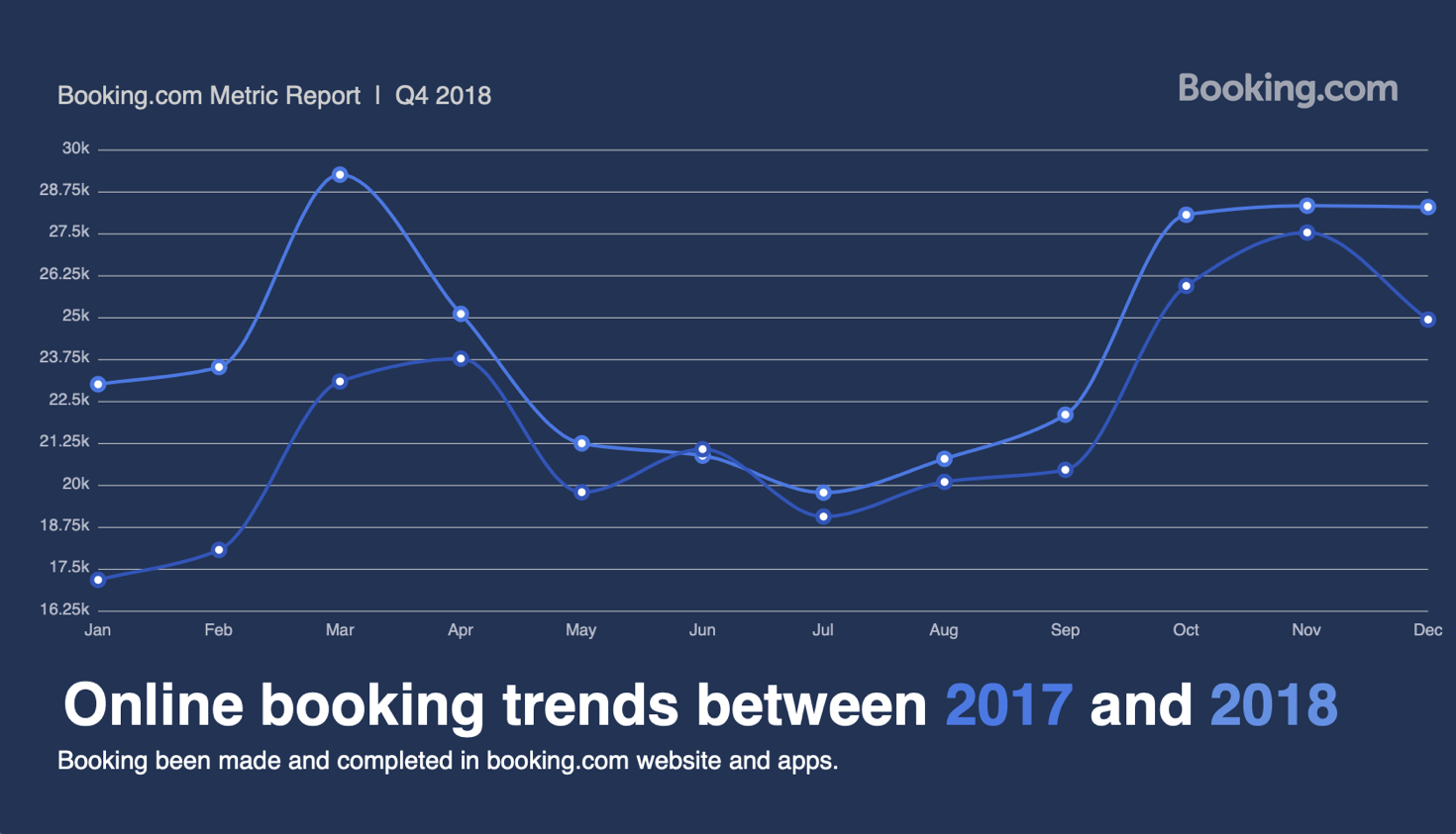
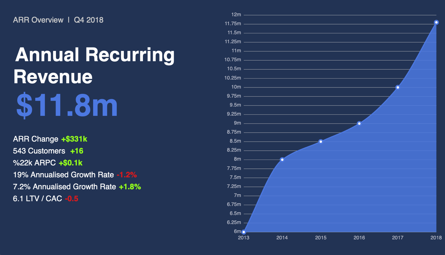
Using charts or graphs to visualize data sets is easier than poring over spreadsheets or reports. Data visualization is a fast and easy way to universally represent insights, trends, and performance in a way that everyone can understand. We’re excited to announce that Appspace will begin rolling out a data visualization card template on March 8th, 2019.
Flexible Data Visualizations
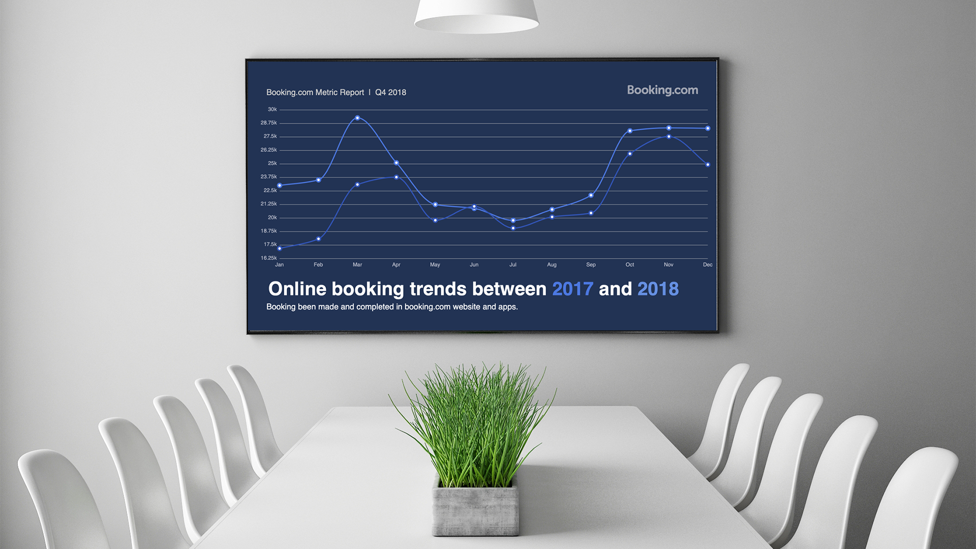
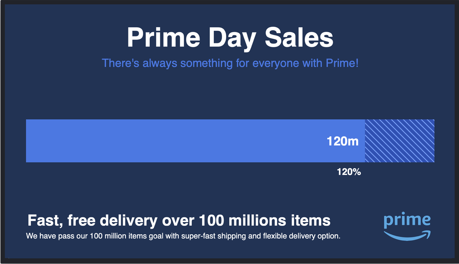
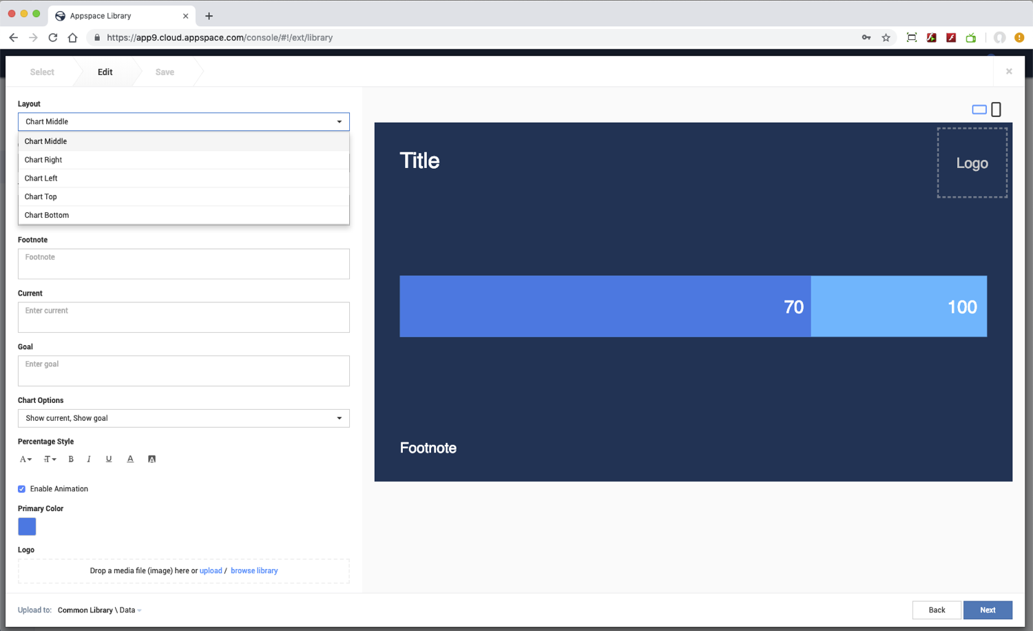
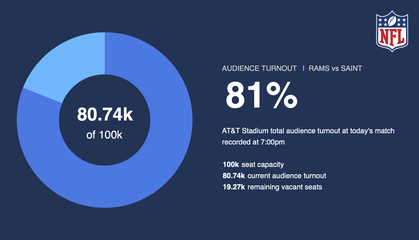
The first release of the Data Visualization card ships with three visualization options; line chart, progress bar, and a donut chart. Like all of our HTML5-based cards, the data card is an easy way of sharing on-brand company information quickly. Data cards will also contain several customization options and animations.
Customized Layouts & Formatting
As well as the brand compliance controls, that come with every Appspace card, the Data Visualization card offers several additional formatting options. Customize layout options, chart positioning, chart axis & labels, plus add supporting data values such as percentages and actual vs. goal.
The resulting cards provide your team with easy to understand data ranges that are displayed on digital signs, collaboration displays, and other displays in the workplace.
Look out for the Data Visualization card in the Appspace 7.0-ac.28 platform release.
For more information on this release, check out the release notes.